
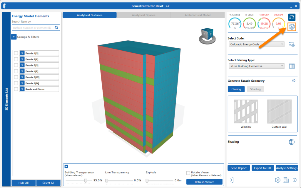
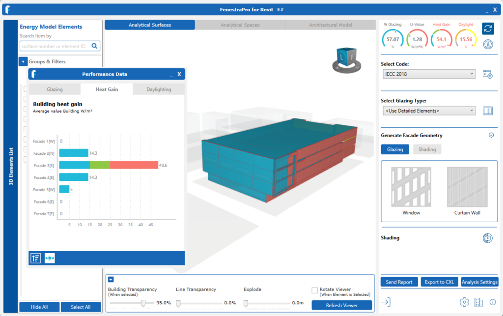
The Charts may be opened by clicking the icon below the Refresh button. Charts display for Glazing Percentage, Heat Gain, Daylighting. Shading Percentage Charts will also display (if shading is included when calculating results).
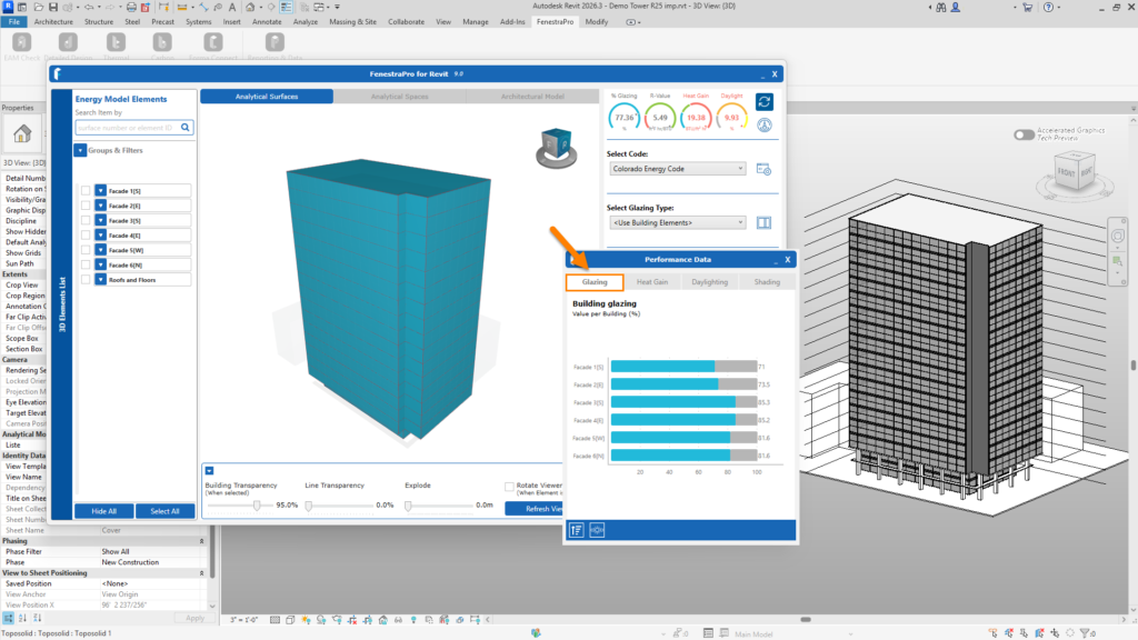
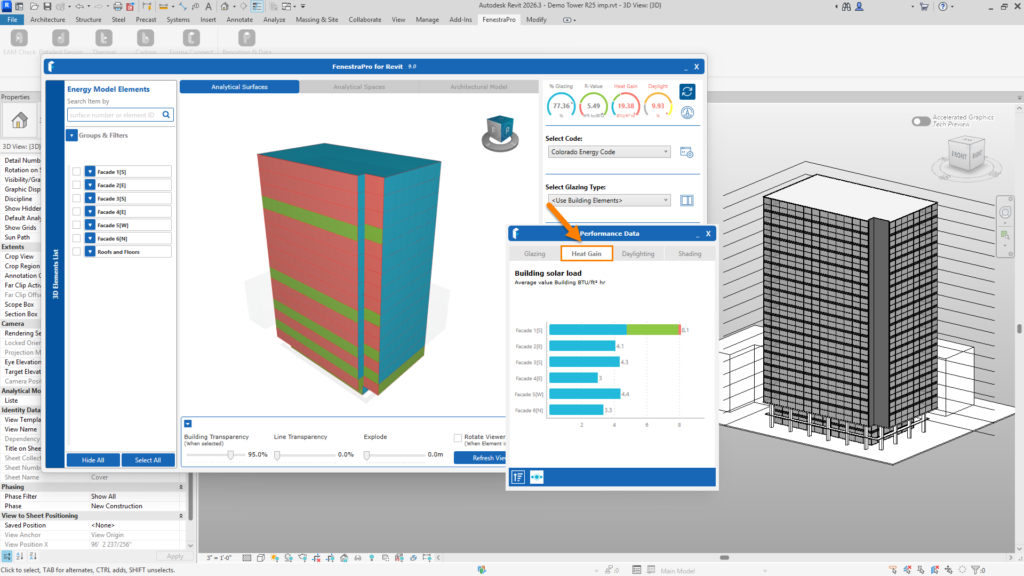
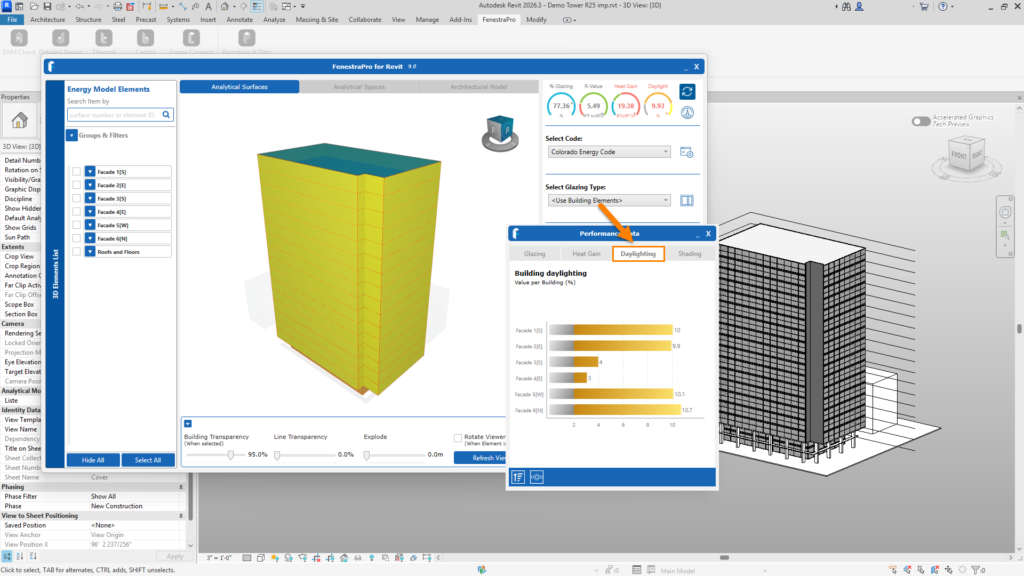
The highlighting color on Surfaces in the Model Viewer will depend on the active Chart :
- the Glazing Chart will create blue highlights
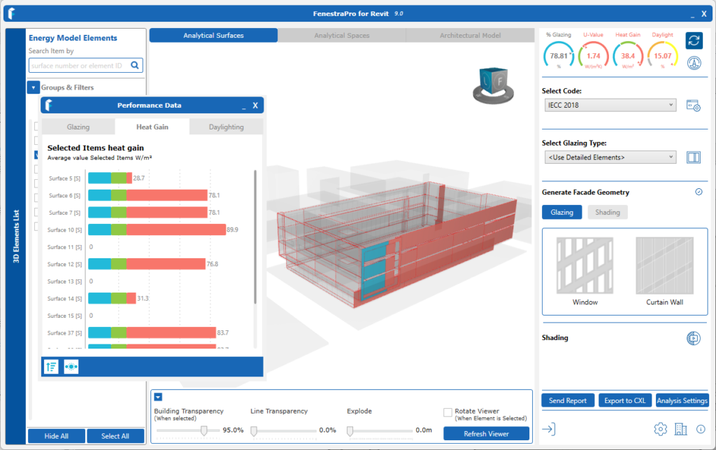
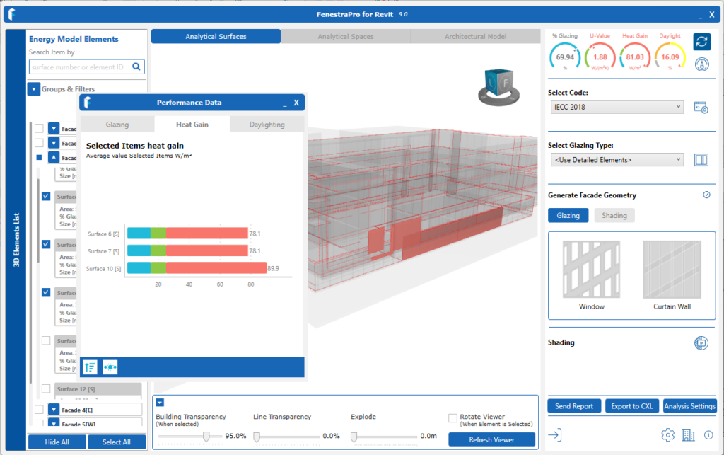
- the Heat Gain Charts will create highlights in blue/green or red
- Daylighting Charts will create highlights of yellow or grey
- Shading Charts will create grey highlights
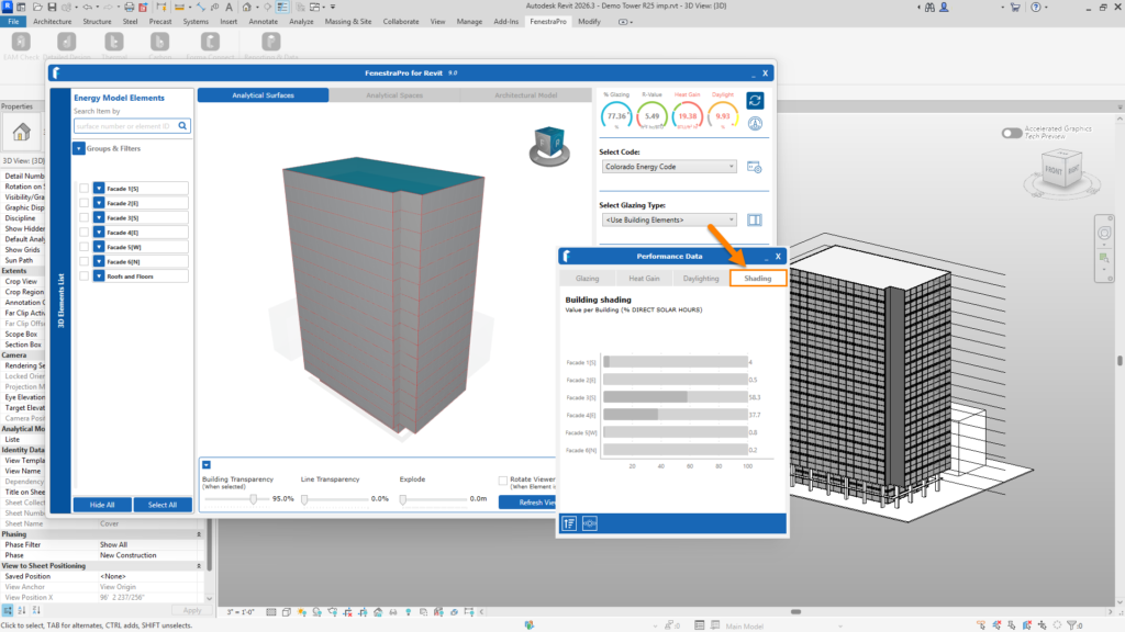
Make selections using the Charts
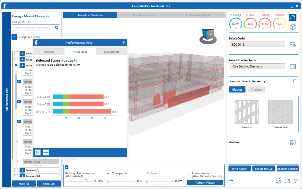
You may also make selections on the model using the Charts. You may select into a Facade and all Surfaces within this Facade are displayed. You may then select one single Surface. It is not possible to select random multiple Surfaces using the Charts (you may do this on the model itself or using the Facade Navigator). Selections and Roll Up (reversing back out) is available for all Charts. No matter which method is used to make selections, all features are connected and will update to be consistent (Charts, Facades List and Model Viewer will all reflect active selections).
It is not possible to select random multiple Surfaces using the Charts, however you may do this by selecting Surfaces on the model itself or using the Facade Navigator (the list of Surfaces on the left-hand side). Selections (Facades to Surfaces to one Surface) and reversing back out to all Facades again, is available for all Charts.
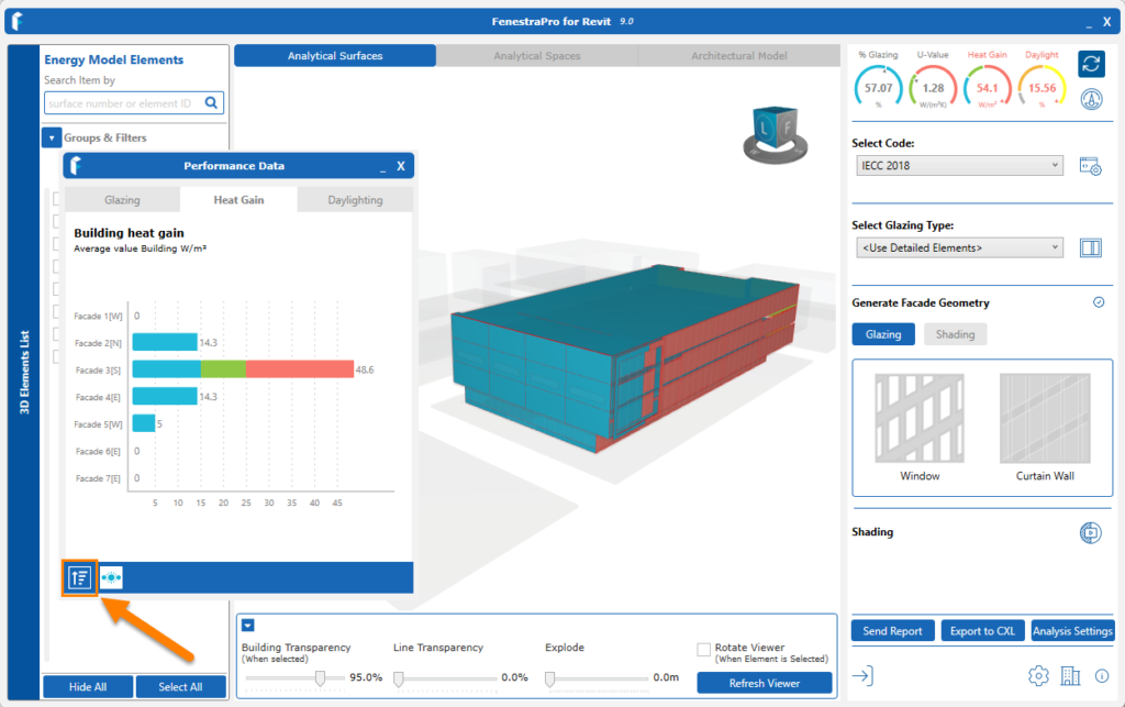
Reversing back out may be done using this icon 
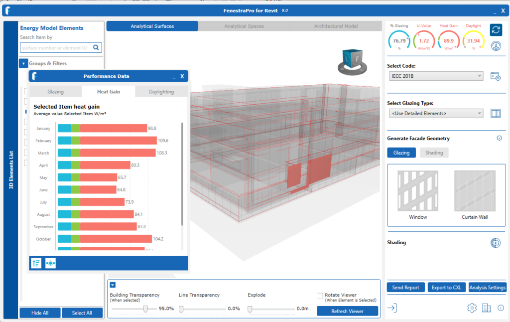
Het Gain Charts also may be displayed using peak or average values using this icon 
These may be found at the bottom of the Heat Gain Charts here:

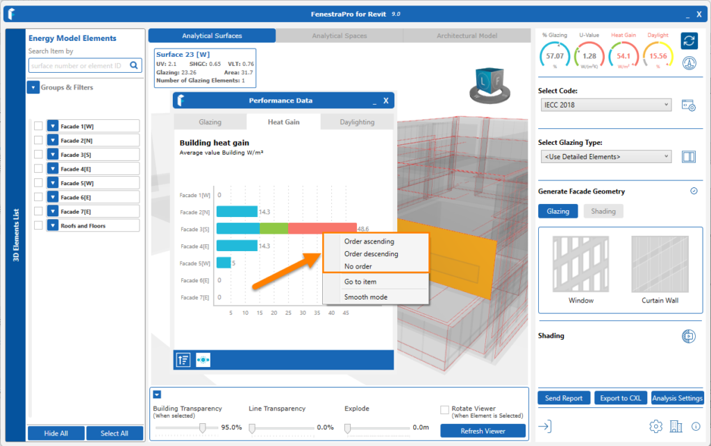
Sorting
You may also right click on the bars in the Chart and select a display style (Smooth or Separate Colors) or sort by ascending to descending values, have no order etc.
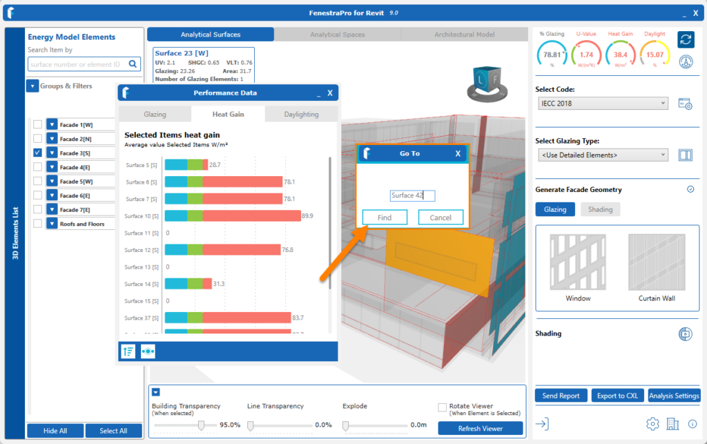
Go to item
There is also an option to adjust the Chart list up or down to find a known Surface/Facade number, where there is a large quantity. A window will open to enter the Surface name. Click on the Find button to display the relevant Chart for this area. For example, enter ‘Surface 10’ or ‘Facade 21’ etc
Note: this will not open a new Chart that includes the searched name, it will move the existing displayed list up or down so that this searched item is displayed, without you having to scroll.
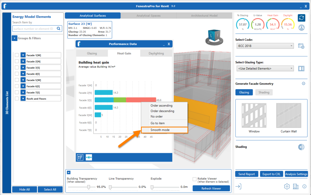
Display Styles
By right clicking on any bar on the Chart, the display style can be set. Choose between Separate Colors or Smooth Mode (which creates a gradient between the ranges). Once a style has been selected, the other style displays in the list as the alternate option.
The Charts will display relevant information for the Surface(s) or Façade(s) currently selected. Clicking on a bar on the graph will provide more detail on the Percentage Glazing/Solar Load/Daylighting for that Surface or Façade. To navigate back to a graph displaying all Facades, click on the ‘roll up’ button which will return to the overall Chart.
Selections
You may make selections from the Chart itself or from the Facades/Surfaces list in the Facade Navigator. You may also select areas from the model in the Viewer by hovering over Surfaces and clicking. This will define what is displayed in the Charts.
- When no Facades or Surfaces are selected, the Charts display results for all Facades.

- When a single Façade is selected, the Surfaces within that Façade will display in the Chart.
-
If two or more Facades are selected, all combined Surfaces are displayed.
- When an individual Surface is clicked on, the chart will display that Surface only. If a single Surface is selected, the monthly values are displayed in the Solar Chart.

- If multiple Surfaces are selected, the Charts will display for each and the Dashboard will show a weighted average result for all selections.
- Selections are made first from All Facades – to one Facade – to a single Surface. You may then reverse out back to All Facades by clicking on the ‘Roll Up’ arrow provided. Other buttons such as the Peak / Average toggle button for Solar Charts and Charts for Shading Guidance are explained in the further articles below.
Highlighting
Colored highlighting on the model occurs when each Surface is selected to indicate location and the current condition depending on the Chart category chosen e.g. If Heat Gain Charts are selected – highlighting on the model will show red, green or blue depending on overheating, optimum or under-heating. If the Daylighting Charts are selected, the colour will be yellow or gray depending on the amount of daylight received.
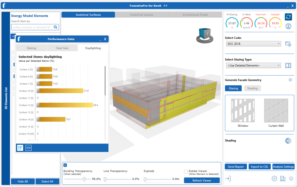
Note: you may not see the desired highlighting on the model unless the Charts have been opened the first time since highlighting is connected to the Chart selected. The Charts may then be hidden and different Surfaces selected if you wish, the highlighting will continue and move to different Surfaces/Facades.

