Common to both Concept and Detailed models
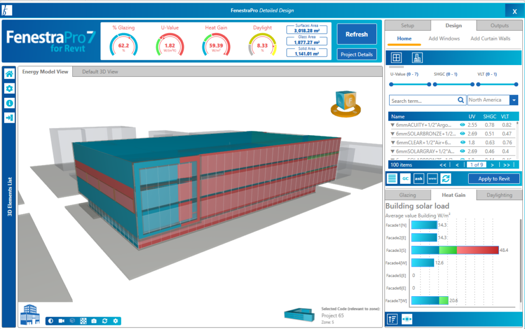
This Chart provides information on the solar load, or heat gain per unit floor area (BTU/ ft2 F hr or W/m2). You can navigate between Façade and Surface quantities along with a month by month breakdown. To easily recognize the heat gain ranges, bars will appear red when overheating occurs, blue when underheating occurs, and green when an optimum range is reached.

Concept Models
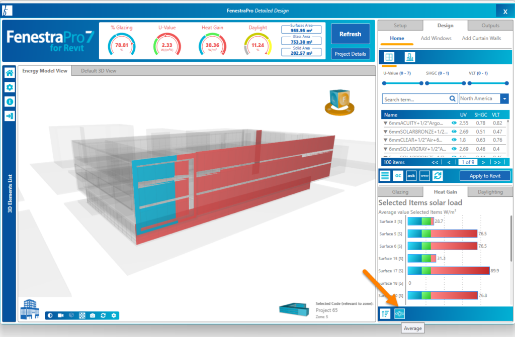
If you click on one Surface, the Charts will show monthly results for that surface.


Peak Loads / Average Loads
There is also an option to display either Average or Peak Solar Loads. Click on the icon shown to switch to Peak Values for each Facade or Surface. When you hover your cursor over this control, a message will indicate the alternative Chart that can be displayed. You may use the Charts to navigate areas on the model as usual.

The graph icon with a line halfway indicates Average Results. The graph icon with a line at the top of the curve indicates Peak Results. The button will toggle between the display types.

The Charts window may be resized (when undocked from the main window) by dragging the lower right corner to create a larger or smaller window. Selections may be made from the model viewer by clicking on a Surface. This will then highlight on a Concept model and become selected in the Facade List. Highlighting colors on the model will depend on the active Chart.

Detailed Models
You may make selections on the model using the Charts. You may select into a Facade and all Surfaces within this Facade are displayed. You may then select one single Surface. It is not possible to select random multiple Surfaces using the Charts (you may do this on the model itself or using the Facade Navigator) and they will also display in the Charts.
The Dashboard (values in dials) will display the average results of all selections made.

There are controls provide in the Charts area to toggle between Average and Peak values and to ‘roll up’ which will reverse out of selections made, back to display all Facades on the model. Charts will start with all Facades displaying. Then you may click into Surfaces within a single Facade – then select a single Surface. Use the Roll Up button to reset the Charts (all selections are removed).
Selections and Roll Up (reversing back out/deselects Surfaces) is available for all Charts.

![]()
